Branding Your Website With Better UI
Along with learning the principles of web languages, I needed to apply my skills to solving real-world problems. So I located a website that did not have an appealing UI, then designed and built a new replacement site using HTML, SCSS, and JavaScript.
At first, I thought It was going to be hard to find a poor design website nowadays. So I googled poor design website and I found this website. It is a website about an American author and television writer Suzanne Collins. This website introduces herself and her books. The Hunger Games series is very famous and I was surprised by how basic her website is.


Problems
This website does not have a logo, and as you can tell the hamburger menu is not displayed properly on the medium screens.
The design of this website is not very nice. Her website is divided into 3 columns, but the left column on some pages is empty, it resulting in an unbalanced layout. On the works page, the pictures of her books are in the left column, but the descriptions are in the middle. I think the layout design is weird, and for these reasons, I had to redesign this website.
Actions
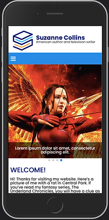
I first created a logo for this website so it looks more professional, and the header would not be showing just the author's name. I created 3 sizes for different screen sizes. Then I created a new color theme for this website, with dark blue as the primary color, and light blue as the secondary color.
Instead of showing the book categories on the right column, I made them as second-level navigation under works. The hamburger menu is only shown on small screens. Navigation on medium to large screens is flex. Under the navigation, there's a responsive image slider to show one of Collins's well-known book series The Hunger Games. The images slide automatically. I also created cards with images and text on the home page to show what's new and some other stuff that the users might be interested in.


For the Works page, rather than separating the books and the descriptions, I put them next to each other, that way it's a lot easier to read. On the Biography page, other than a description of the author, I added a form for users to fill out to join a giveaway activity. The author can get feedback from the readers and find out which book they like the most. The users will fill out some information to possibly win a signed book and send it to the address they provide. They will visit a thank you page after submitting the form.
The Gallery page showcases pictures of Suzanne Collin participating in the Hunger Games' activities and some trailers of the movie too. Since the pictures are larger, I used lazy load on this page for these pictures.
Conclusion
I was able to demonstrate what I've learned in this class in this project and make the website nicer and more functional. I enjoyed doing this project and am happy with the result. Aside from the development skills, I also learned that it's very useful to push code on GitHub regularly. I push my code every time I finished one section, so in case I mess something up in the next step, I can also go back to my previous commit. The pictures below show the full four pages of the project. Or simply click "Visit Page" below!


